Gather AI - Archived Clients Dashboard Enhancement
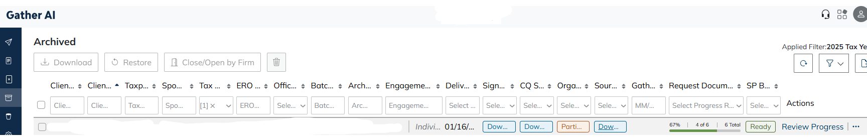
Please change the selection and placement of the columns in the "Archive" dashboard to be similar to how the "Delivered" dashboard works. We often do more in the Archive dashboard and it is just a mess to work with. Too many unneeded columns make all columns too small! an example is below, but it is hard to see.
Comments
I have also asked this to be done. It's ridiculous they can't just make them all be the same from the beginning.
The archived section is so hard to read and needs to be customizable like the delivered section. In order to sort through all of our clients we have been closing and archiving clients, but once they are in that screen we can't really see what's going on.
With the upgrade that was implemented in April 2026, we now have a scroll bar to see all columns, this is a nice feature. However, we would like to be able to exclude and rearrange columns as we do in the "Delivered" dashboard. Standardization of this type will make training new users much easier.
Also, it would be nice if when using the new (and very narrow/hard to grab) scroll bar, the client name is "frozen" on the left side as you scroll. This would help when looking through the list at a number of clients. Without the client name staying with the row you lose visibility to which client the row is related to and you have to keep scrolling back and forth. This is annoying and wastes time.
Please sign in to leave a comment.