Gather AI & Returns Column Widths Too Wide
Post-April Update: Gather AI and Returns columns are now very wide, fixed width.
The Status Columns in Gather AI are more than double the width of the longest possible status. Why?
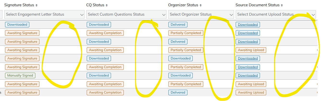
This is a huge quality of life downgrade because I am usually trying to get to the "Actions" column located on the far right of the screen to either click "Process" in Returns or "Review Progress" in Gather AI. "Actions" can't be re-ordered like the other columns. I either have to eliminate almost every single column to get "Actions" onto one screen, or I have to click and drag the horizontal bar for every client. This is reducing efficiency and increasing clicks for every individual client.
Here are some suggestions for possible fixes:
1) Create a compact view that eliminates the blank space above
2) Make the columns adjustable
3) Put it back to the way it was before the update - this was fine before and I could see everything
Thank you for your consideration!
Comments
I agree with Stephanie here. The column sizing not fitting the contents and the inability to resize them have been a source of frustration for us. Important information like client names are truncated while other columns are grossly oversized, sometimes as much as 3x wider than the content.
Implementing a compact view requires only minor changes to the table styles. Using the Returns > Delivered Returns as an example, the "deliveredReturnsTable" class needs to have "table-layout: auto;" style added. Then each table heading would need to have the hardcoded widths and min-widths styles removed. This yields a very compact view that fits the contents of the table without truncation and no whitespace. I imagine this would be an easy fix to implement and test for your dev team and QA.
This screenshot below shows the altering of the HTML.
This last update has sent this program backwards!
Please sign in to leave a comment.